How to hide DIV content if shown on mobile view HTML Responsive
Technology 0 Comments
Show and Hide different Content and div on Mobile Devices ,Tablet Devices , Desktops Devices wordpress Design , HTM responsive design .If we are create a any responsive design so we are check and testing the design on all devices and number of time come the some problem that we content and div is not open in proper way in mobile and tablet devices , desktops devices. So we are display the some trick that minimize and maximize the text content and div in responsive template that how to hide the content in mobile devices ,tablet devices , desktops devices this trick is used in the all type of template used in wordpress Design and HTM responsive design and used with CSS and used in CSS file
In this case we can used the ID and class in CSS file and CSS include in HTML file
How to used the media screen used in CSS and HTML.
Used in CSS this code
<style type=”text/css”>
@media screen and (max-width: 1290px){
#bottom{ display:none; }
}
@media screen and (min-width: 1280px) {
#bottom2 { display:none; }
}
</style>
Used this code in PHP
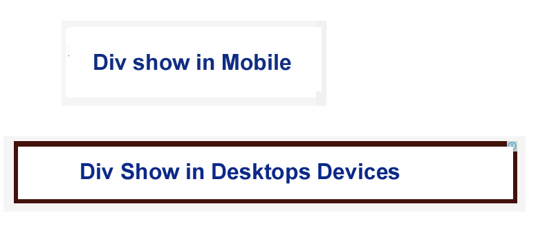
<div id=”bottom”>This code show in this PX 1290px</div>
<div id=”bottom2″>This code show in this PX 1280px</div>
1290px and 1280px is a screen resonance in px for according to Devices
Buy online Rajasthan gk book Railway JE CBT REET PAtwari Book SSC CGL Clerk GD Book Buy online Rajasthan gk book Railway JE CBT REET PAtwari Book SSC CGL Clerk GD Book
 0
0 0
0
 0
0